
Designing a DevSecOps Platform for Streamlined Cloud Management with Cloudsania
Cloud infrastructure management is often complex, requiring teams to navigate multiple cloud providers, security protocols, and deployment workflows. Cloudsania is a DevSecOps automation platform designed to simplify cloud operations by providing a centralized, secure, and scalable solution.
As the UI/UX Designer for Cloudsania, my role was to create an intuitive and seamless experience for developers and IT teams. The goal was to reduce friction in cloud deployments, improve usability, and enhance security workflows within the platform.
Role
Role
UI/UX Design, Product Strategy
Year
Year
2023
Industry
Industry
IT, DevOps
Challenge
A lot of small startups don't have the resources to retain a DevOps team because of competing priorities for inadequate resources. `This could inturn lead to DevOps or security issues in the long run. Cloudsania was designed in a bid to solve this gap. Other existing products designed to fill this gap had several challenges:
Complex cloud management: Managing deployments across different providers was tedious.
Security concerns: Lack of built-in security features made DevSecOps integration difficult.
Cumbersome workflows: Many existing platforms had cluttered interfaces, leading to inefficiencies.
The challenge was to design a clean, intuitive UI that allowed users to orchestrate cloud deployments efficiently, enforce security best practices, and manage resources without a steep learning curve.
Research and Design
I carried out research by interviews and competetive analysis and key insights from the research were:
Users needed clear visibility into deployments without navigating complex dashboards.
Security had to be embedded seamlessly into workflows, not as an afterthought.
A modular, configurable system was preferred over rigid templates.
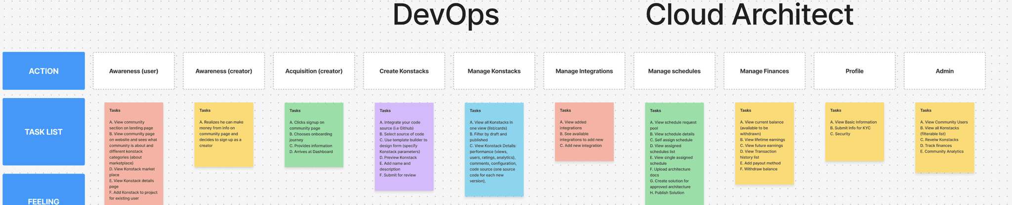
I started with some initial designs to outline the platform’s core functionalities:
A dashboard for real-time monitoring.
A Konstacks module to configure deployment stacks.
A security center for vulnerability management.
After multiple iterations and feedback cycles, interactive prototypes were created using Figma, ensuring a smooth navigation flow and intuitive layout.
Key UX Decisions
Minimalist, functional UI: Avoided overwhelming users with excessive options.
Breadcrumbs & Contextual Navigation: Helps users track their position within the platform.
Pre-Configured Templates: Reduces setup time by offering ready-to-use deployment blueprints.
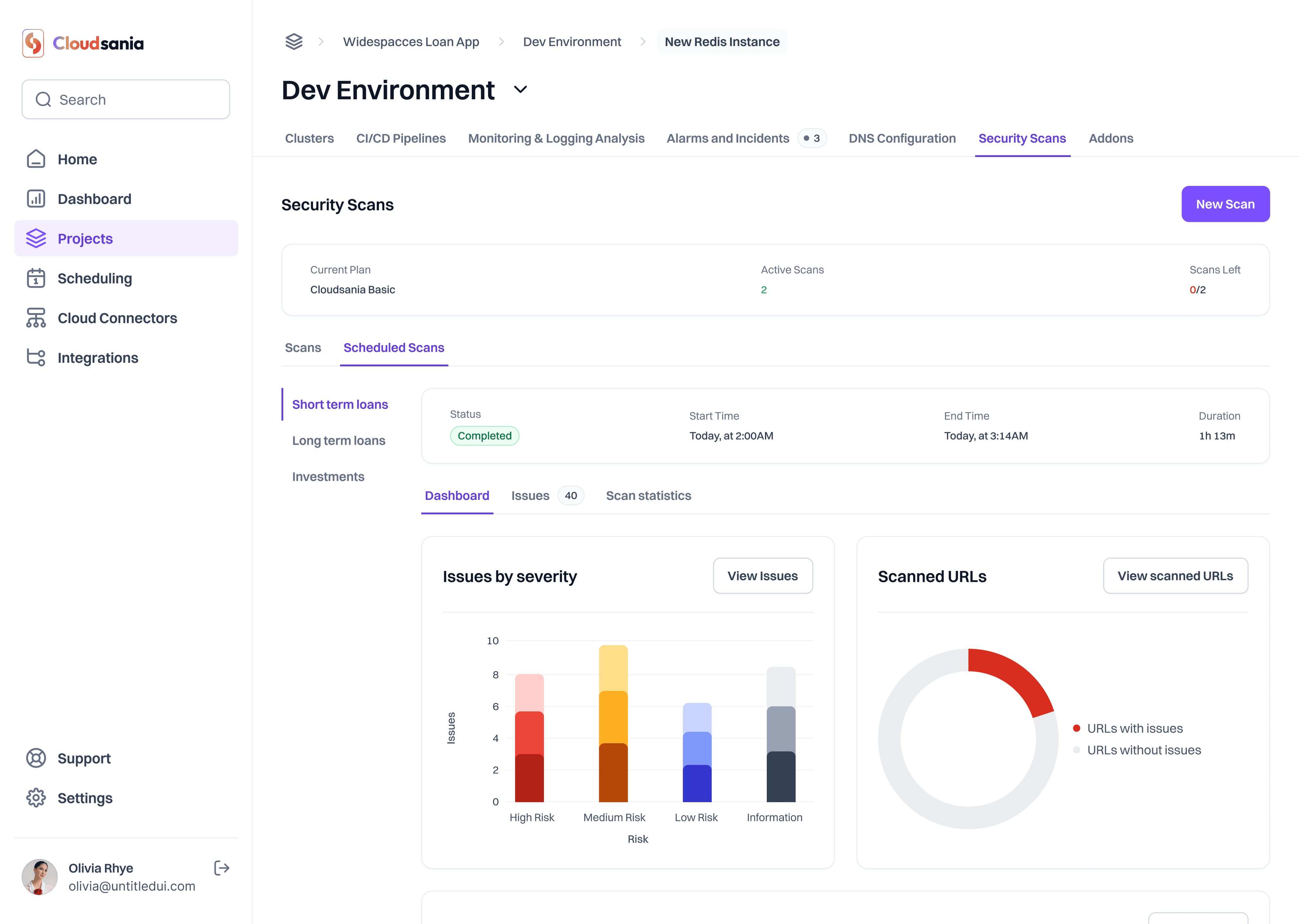
Inline Security Warnings: Alerts users of vulnerabilities in real-time rather than after deployment.
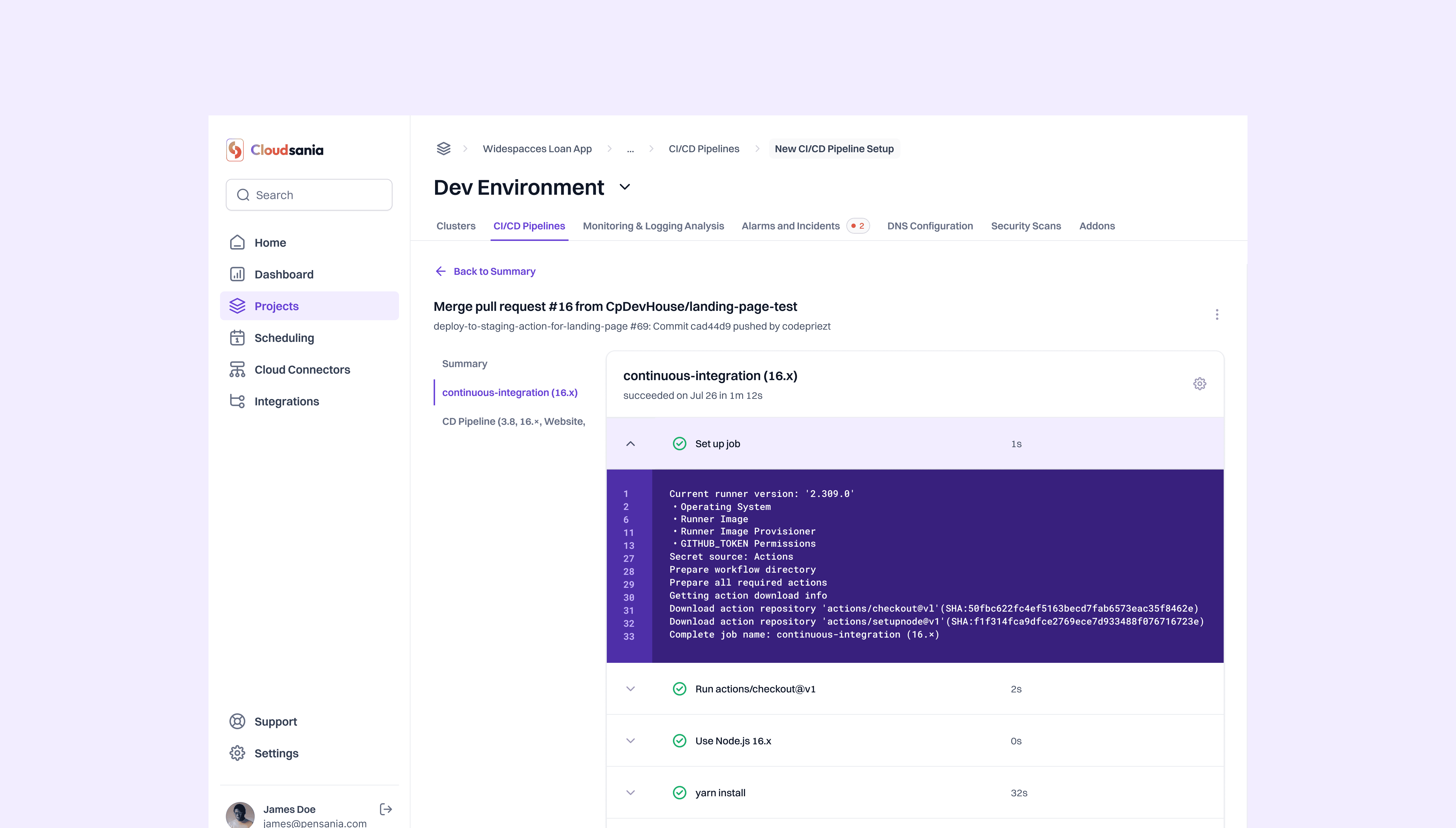
At-a-Glance Metrics: Displays essential cloud deployment statuses, security alerts, and logs in a clean, digestible format.
Customizable Widgets: Allows users to tailor their dashboard based on priorities (e.g., security logs vs. deployment stats).
I carried out research by interviews and competetive analysis and key insights from the research were:
Users needed clear visibility into deployments without navigating complex dashboards.
Security had to be embedded seamlessly into workflows, not as an afterthought.
A modular, configurable system was preferred over rigid templates.
I started with some initial designs to outline the platform’s core functionalities:
A dashboard for real-time monitoring.
A Konstacks module to configure deployment stacks.
A security center for vulnerability management.
After multiple iterations and feedback cycles, interactive prototypes were created using Figma, ensuring a smooth navigation flow and intuitive layout.
Key UX Decisions
Minimalist, functional UI: Avoided overwhelming users with excessive options.
Breadcrumbs & Contextual Navigation: Helps users track their position within the platform.
Pre-Configured Templates: Reduces setup time by offering ready-to-use deployment blueprints.
Inline Security Warnings: Alerts users of vulnerabilities in real-time rather than after deployment.
At-a-Glance Metrics: Displays essential cloud deployment statuses, security alerts, and logs in a clean, digestible format.
Customizable Widgets: Allows users to tailor their dashboard based on priorities (e.g., security logs vs. deployment stats).
Final Design & Outcome
The final product featured:
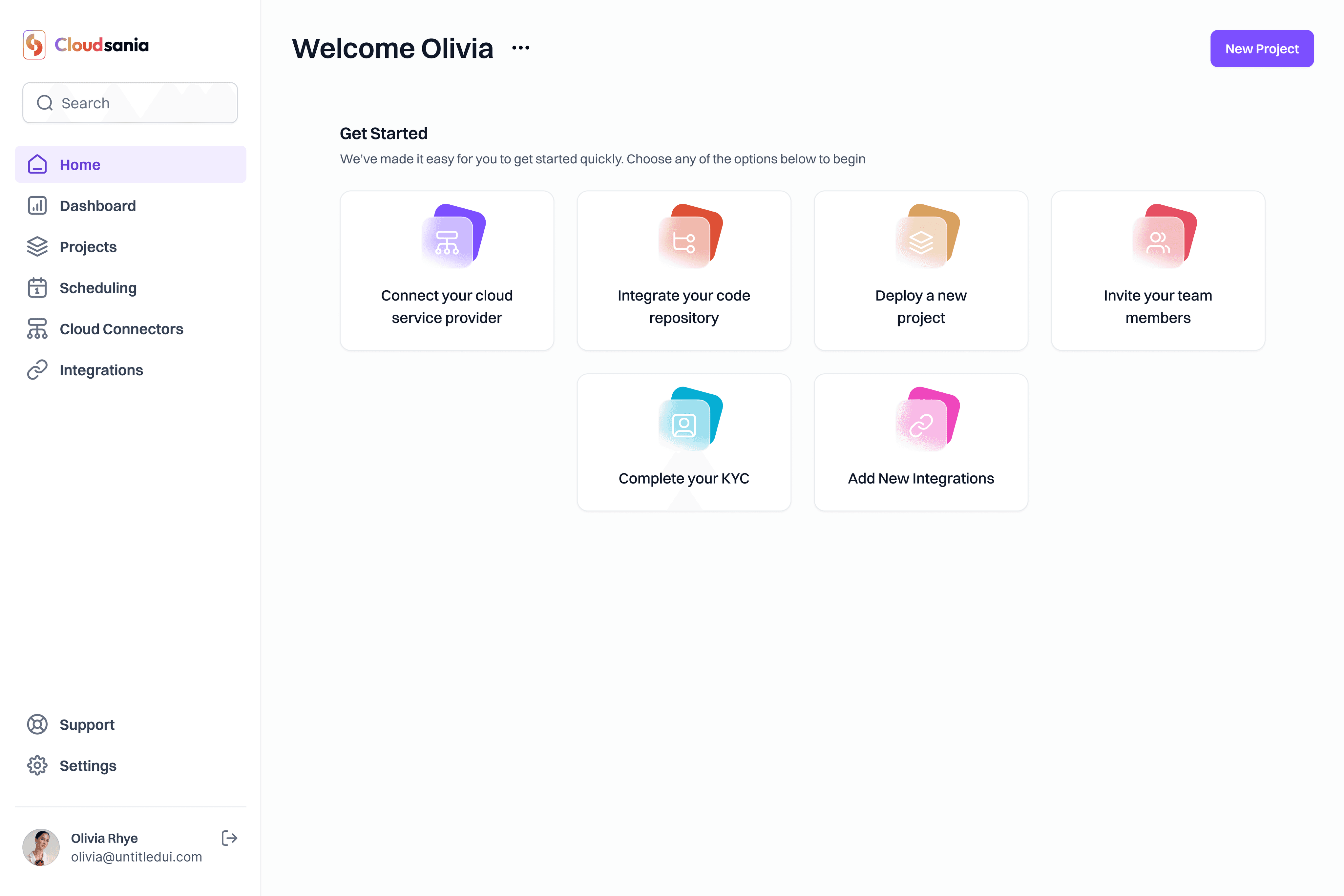
A unified dashboard for cloud monitoring.
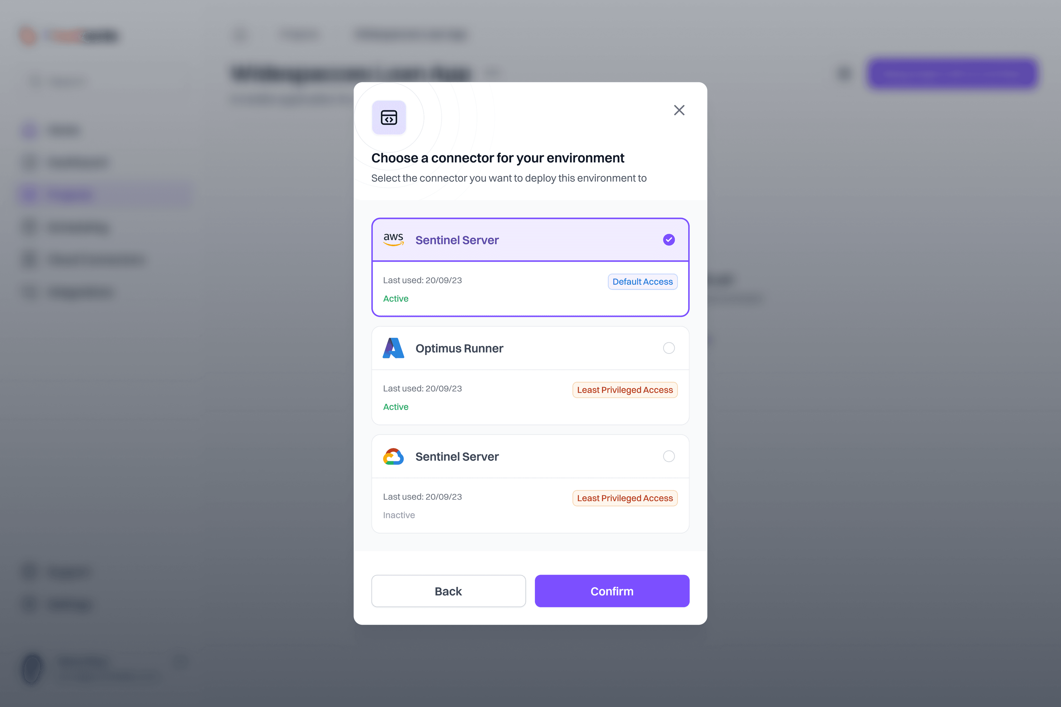
Pre-configured deployment stacks (Konstacks) for faster setups.
Integrated security scanning to automate compliance checks.
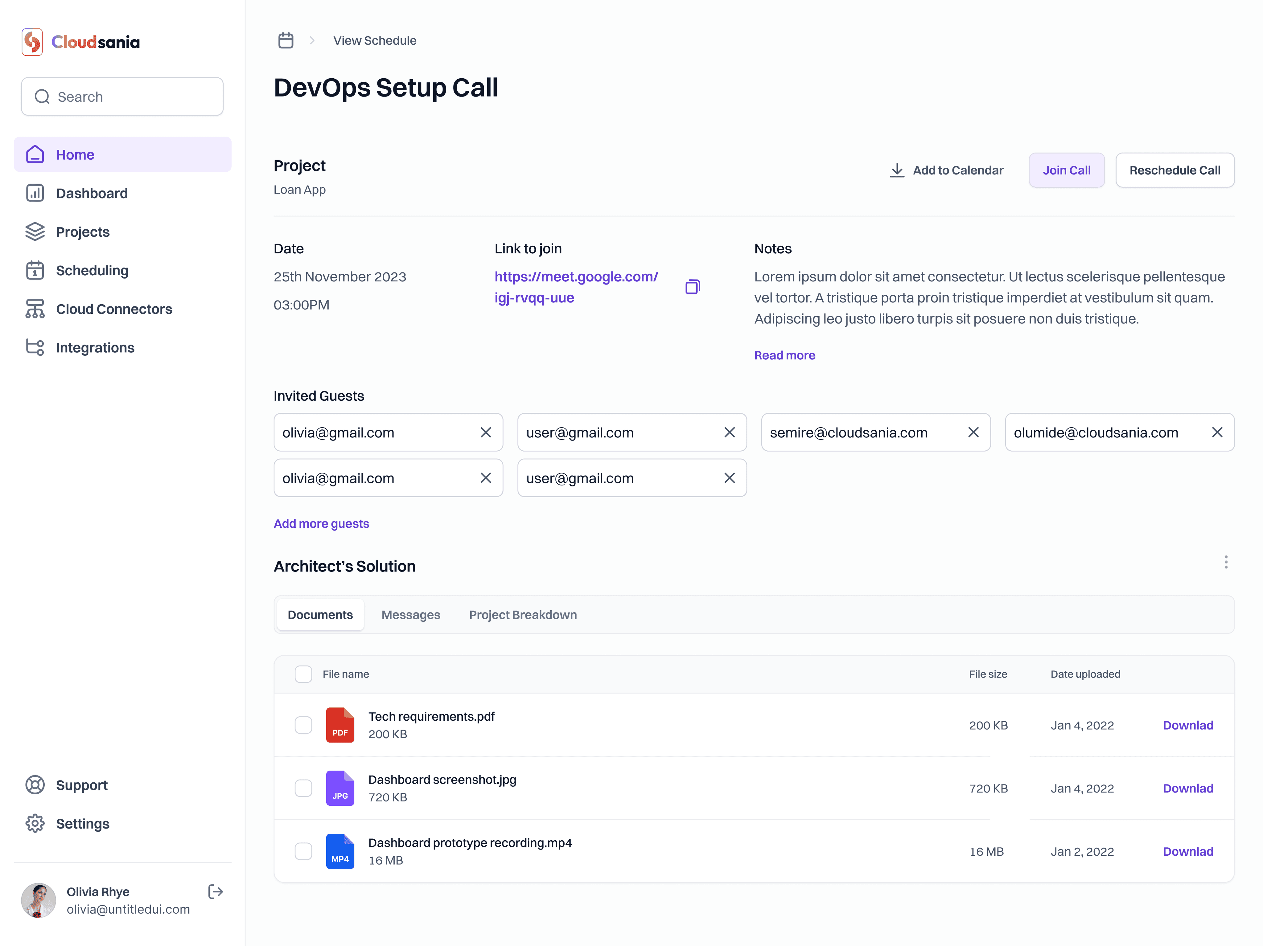
`Ease of access to a cloud architect for consultation through a scheduling module.
A streamlined user experience that reduced setup time significantly.
The final product featured:
A unified dashboard for cloud monitoring.
Pre-configured deployment stacks (Konstacks) for faster setups.
Integrated security scanning to automate compliance checks.
`Ease of access to a cloud architect for consultation through a scheduling module.
A streamlined user experience that reduced setup time significantly.
Reflections and Learning
This project taught me the importance of:
Balancing simplicity with functionality—complex tools don’t have to feel complex.
Iterating based on real user feedback—small tweaks can drastically improve usability.
Designing with scalability in mind—allowing future flexibility in the product roadmap.
If I were to refine the platform further, I’d explore:
More customization options for advanced users.
AI-powered deployment recommendations based on past usage patterns.